Overview
While this page will not show how to make fire and ice from nothing, what we are going to teach is how to make digital photos become more realistic and vibrant. There are photo editing tricks the experts that charge don't want you to know and we are sharing some of those here.
This next section is about Smart Objects. Smart objects are a pain in the butt to learn and understand, however, they are one of those necessary evil type things. There is no 1 method of accomplishing something in digital imaging and smart objects is a personal preference. It may be one of those things that is loved and used daily or it might be another useless fact that we learned.
Using Smart Objects
-
What is a Smart Object?
These are non-destructive layers. Creating smart objects allows for editing a layer and being able to go back to the original layer. We can apply smart filters and the source of the image is stored differently than the filters allowing us to uncheck the filters to see our original layer prior to editing. Prior to the creation of smart layers, a digital editor or artist would need to duplicate the layer and then hide it or duplicate the entire image. Now, we create a smart object. This is one image trick to learn to make our lives much simpler.
-
Why would I use a smart object?
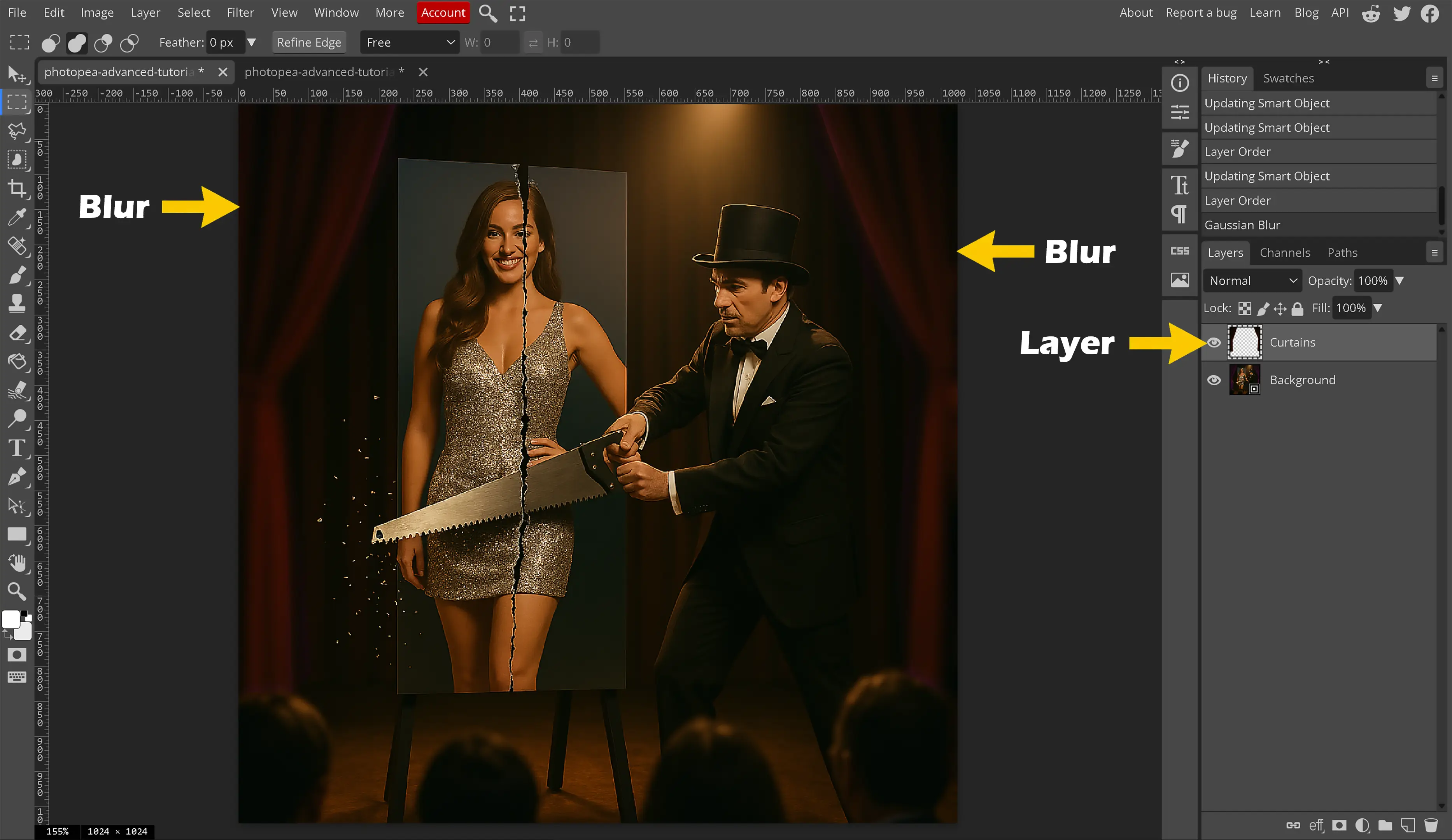
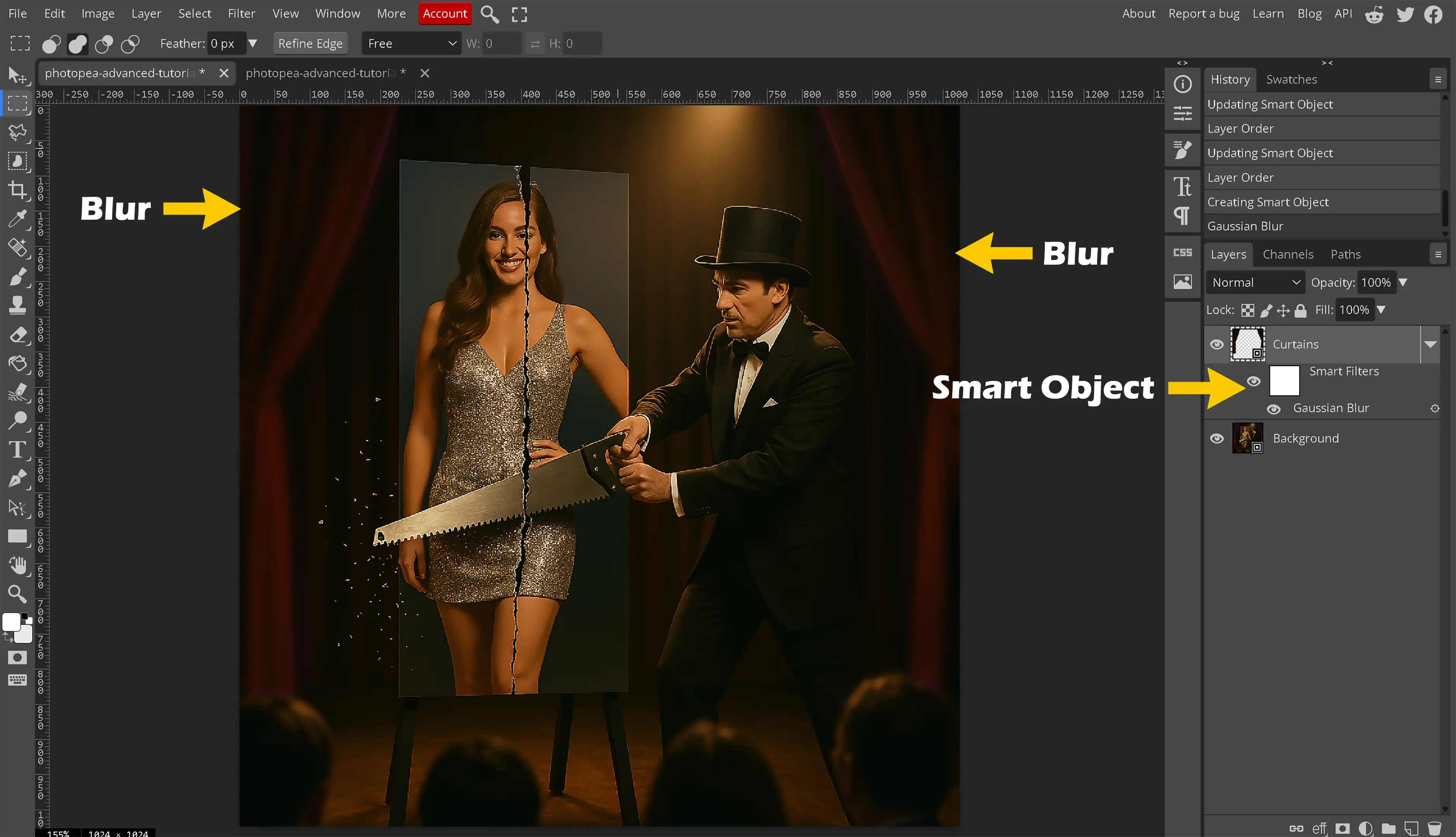
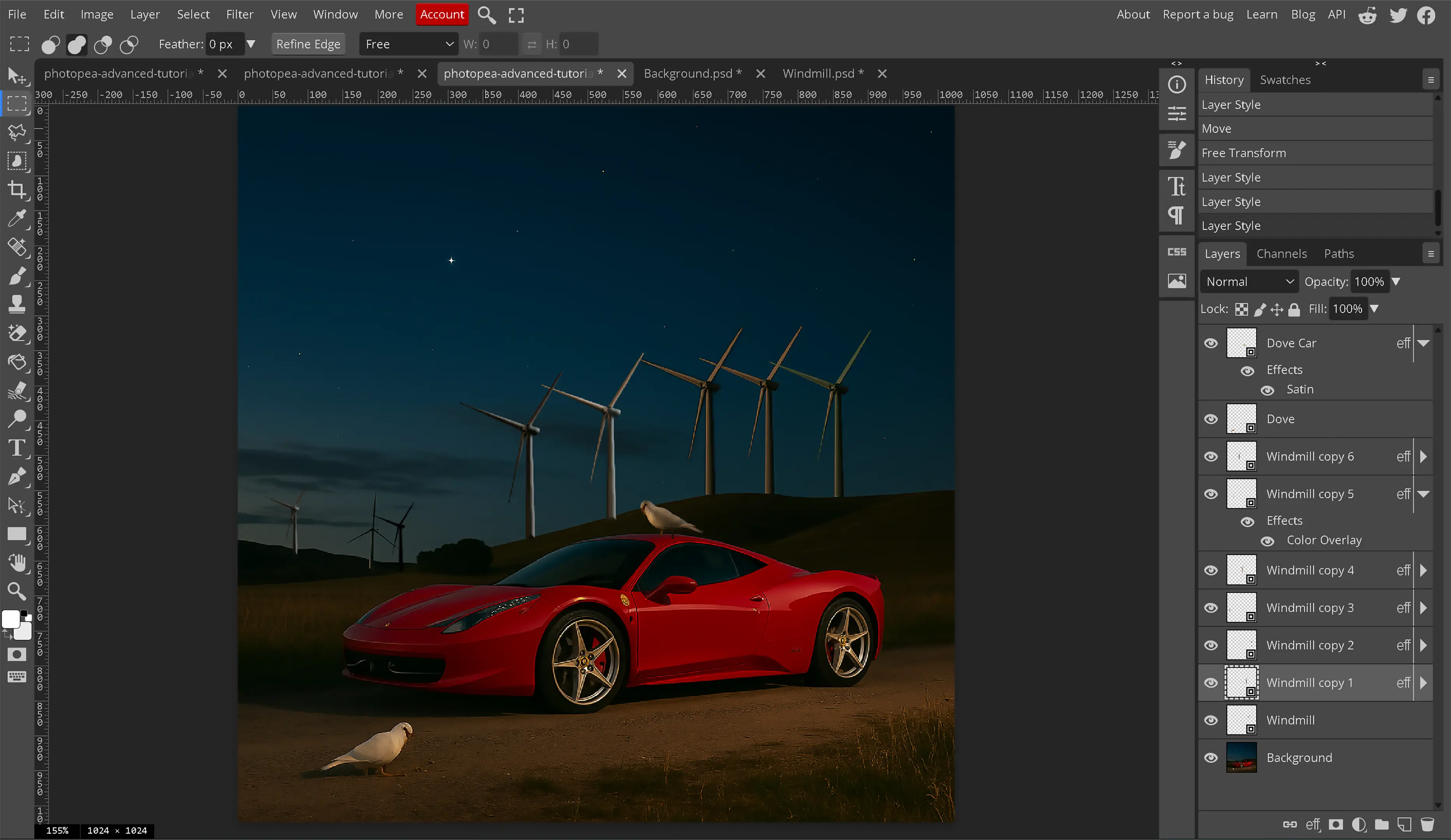
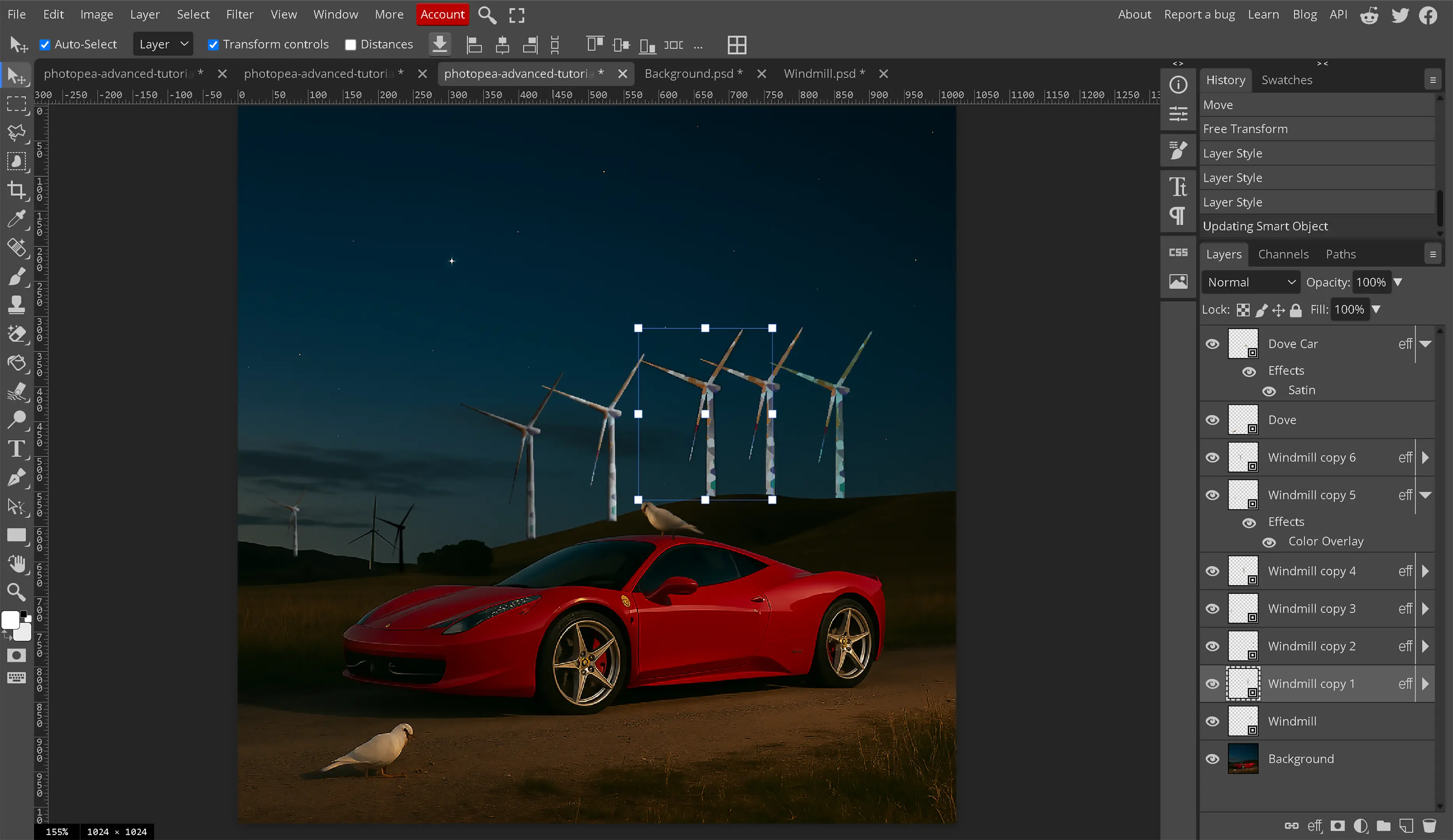
There are two main benefits to using smart objects. The first is that when a smart object is created any filters or edits apply only to that smart object and not to the image and they show up in the layers panel. For example, a gaussian blur effect cannot be seen in the layers panel typically, but on a smart object it can be seen. The next is duplication of the same object. When using layers, a layer must be duplicated and edited independently whereas a smart object can be duplicated. Any updates to that smart object will be reflected in all duplications at the same time. This second one is a semi-double-edged sword. While this sounds really nice, we must think whether we want the doves, the windmills, the clouds, the stars in the night sky or the wheels on the vehicle in the image to look exactly the same. While those objects can be resized, any direct edits will be placed across the entire image to all duplicated objects including shadows, colors, and other destructible edits. The duplications can have filters applied directly to each layer providing the appearance of a different individual object, but 1 wrong change and all the objects are affected.
-
What is a Good Use for Smart Objects?
With a Smart Object, filters, transformations (like resizing), and other effects to the "container" can be applied without damaging the original image inside. Anything that is desired to have the effect on all objects duplicated at once. Shadow effects on pennies standing on a table for example. While these effects can absolutely be obtained using methods other than smart objects, a smart object is just one more tool in our arsenal that we should know how to use even if we choose not to use it.
-
How do I create a smart object?
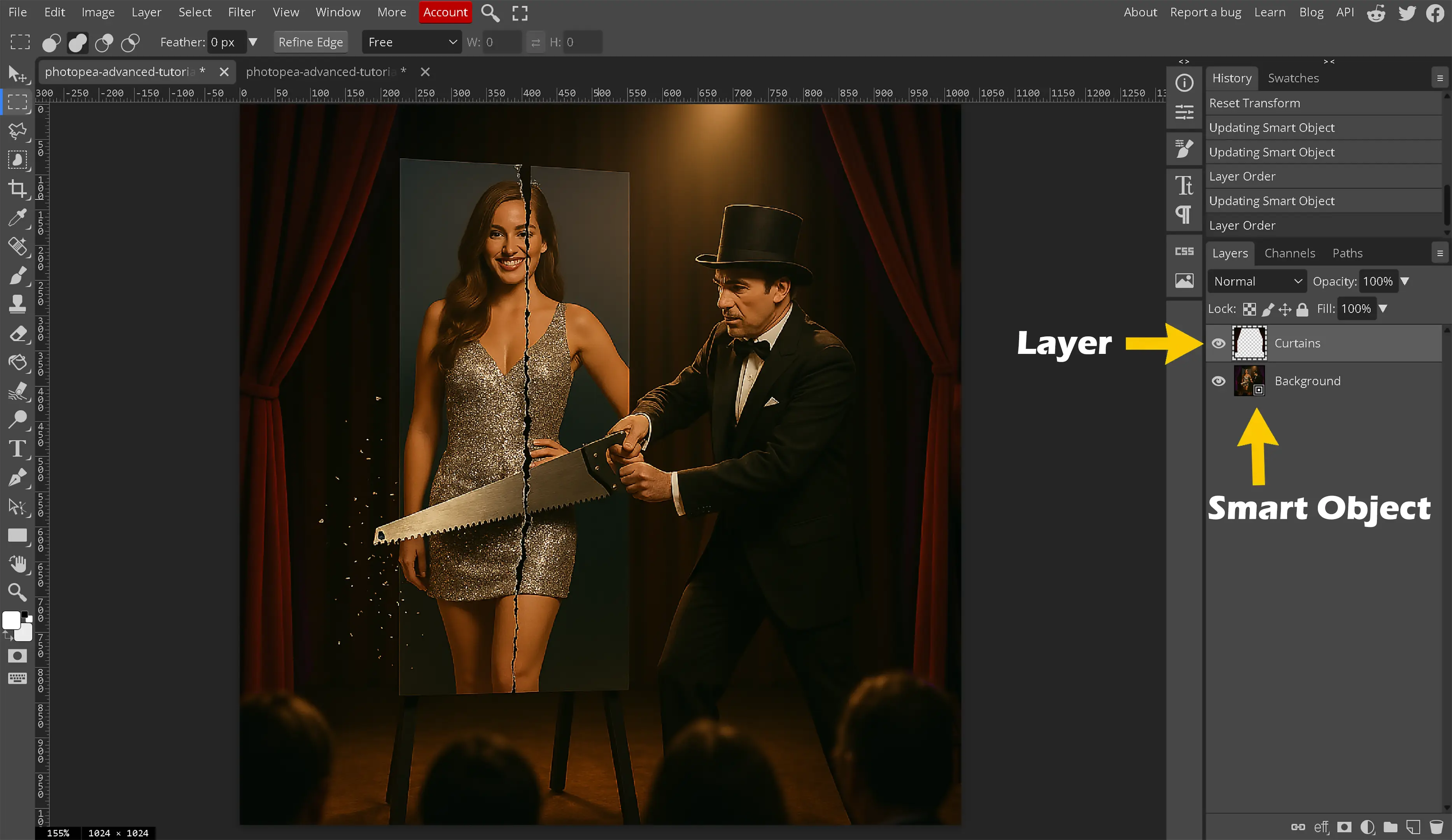
Smart objects are easy to create. Right click on the layer, choose convert to smart object. The layer will now be removed and created as a new PSD file and then inserted into the image. That new PSD is where the source now gets stored.
-
How do I use a smart object?
The main thing that confuses people about smart objects is the inability to directly use tools like the Brush, Eraser, or Clone Stamp on a Smart Object layer. The reason for this feels like a limitation, but it's not. Smart Objects are intended to preserve that object within the composition and they do this by automatically doing what editors would be doing manually.
Think of a Smart Object as a locked, protective container. The original image or layer is placed inside this container. The main purpose of this is non-destructive editing. It protects your original image from being permanently changed. Before Smart Objects, if a filter was applied, painted on an image, and saved it, those changes were permanent with no way to undo those changes. The only way was to duplicate your layers constantly, which gets messy.
-
How do I work with Smart Objects?
If we cannot paint directly on the "container," how do we edit the image inside?
- Double-Click to "Open the Box": In your Layers panel, double-click on the small thumbnail icon of the Smart Object layer. A New Tab Opens: Photopea will open the contents of the Smart Object in a brand new tab. It will usually have a .psd extension in its name. This is the "unlocked" original version of your layer.
- Edit Freely: In this new tab, we can use the Brush tool, the Eraser, add text, run adjustments and all the desired destructive edits.
- Save the Changes: When completed, the contents save that .psd file by going to File > Save or pressing Ctrl + S (Cmd + S on Mac).
- Return to the Main Project: Go back to the original project tab. We can now see the Smart Object has automatically updated to reflect all the changes you just made and saved.
Straighten your images
A very easy image trick is to simply ensure your image is straight. This is an important step to ensuring your viewer is not discouraged. The human race looks at pictures top to bottom most of the time and ensuring your images are straight will make it easier for the viewer to focus upon your intended target.
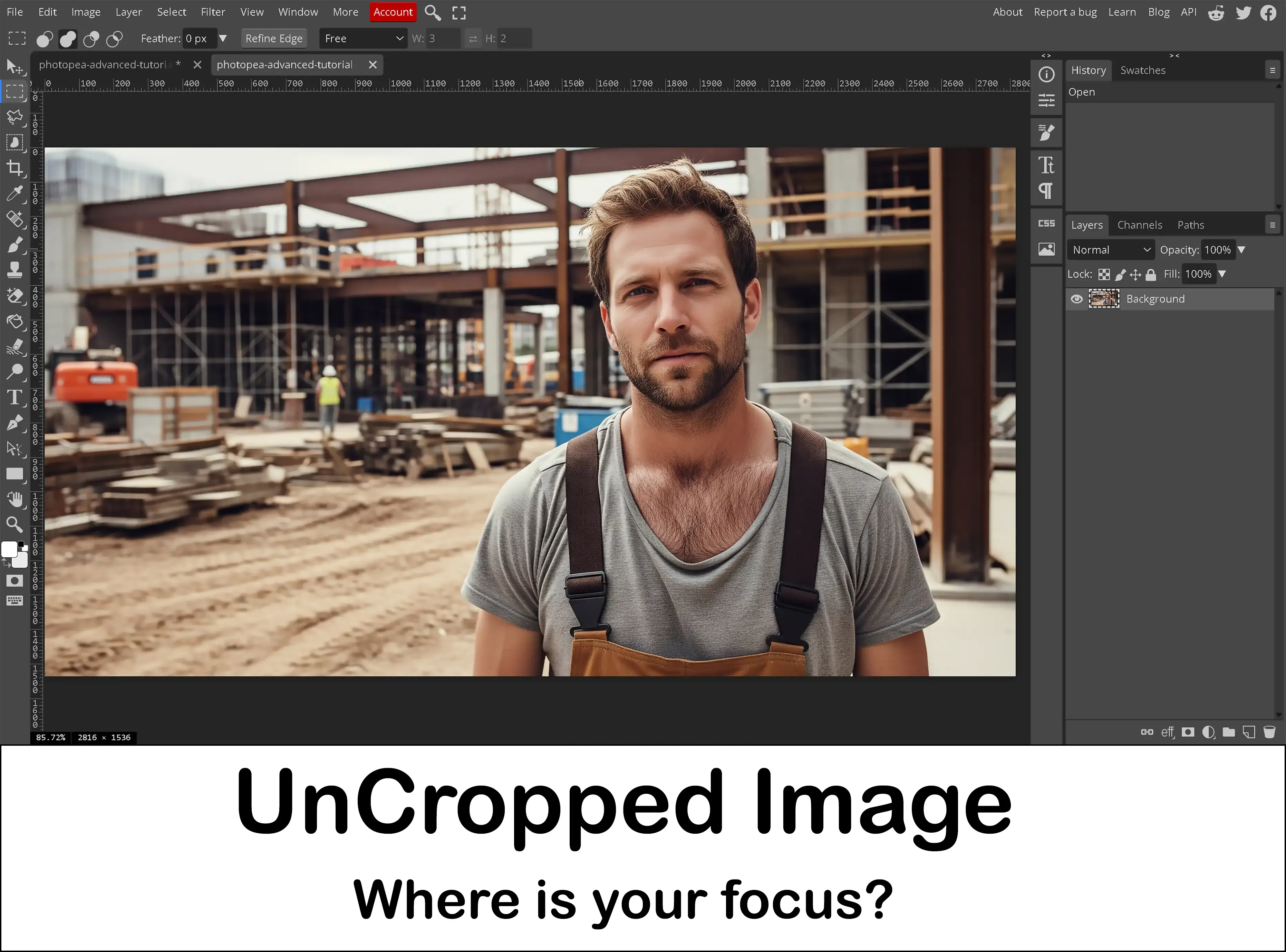
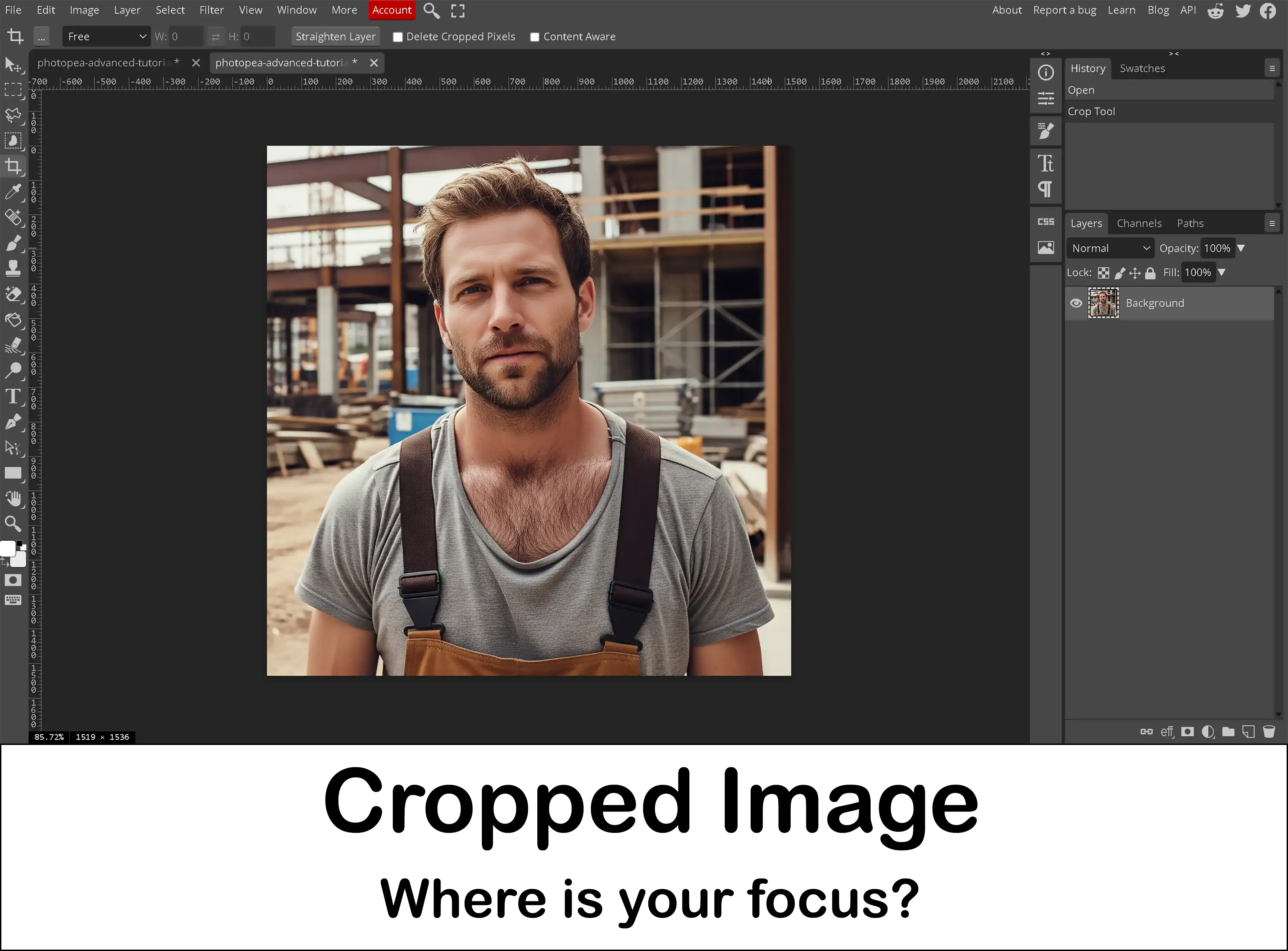
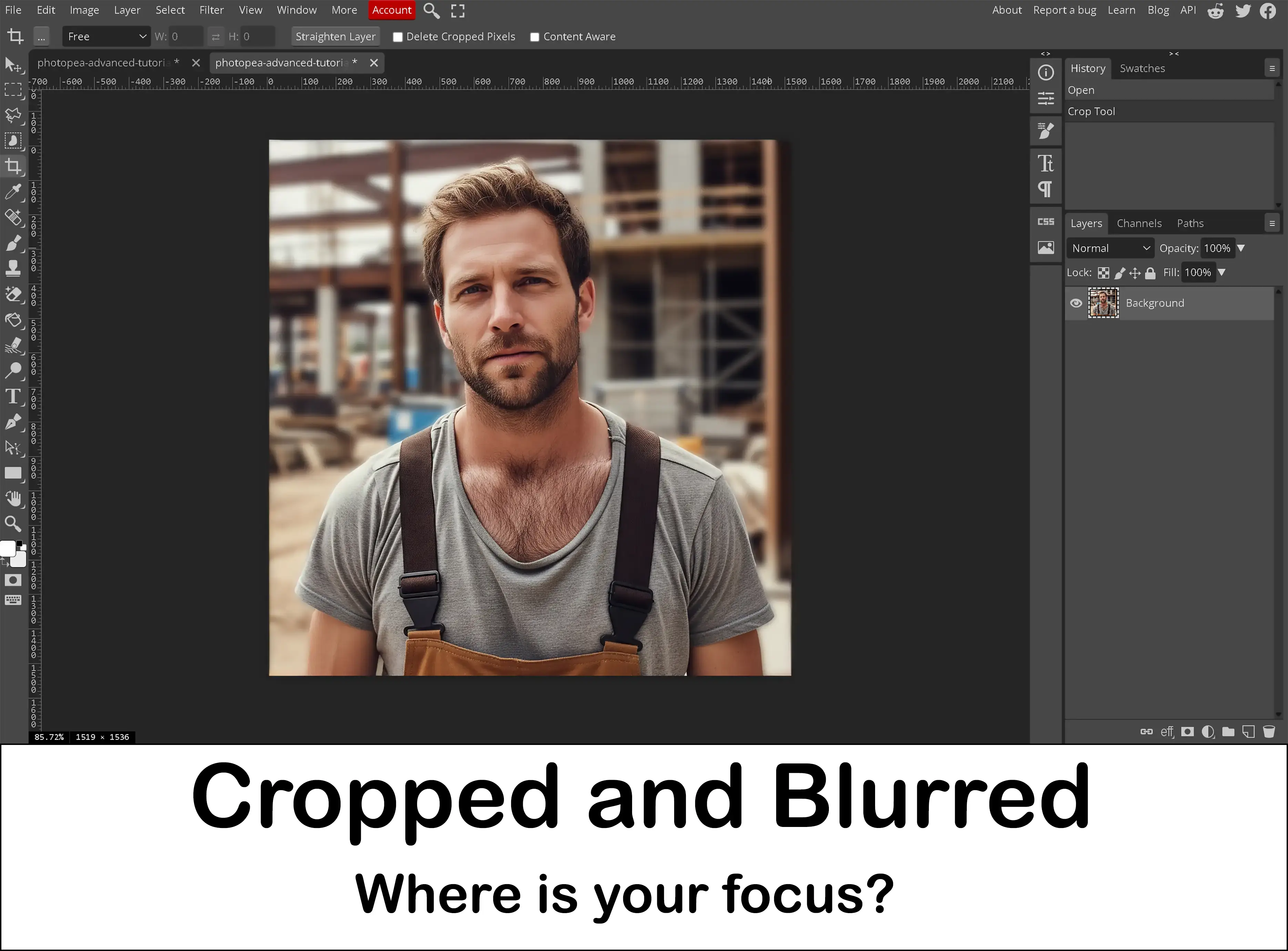
Cropping
As basic as this may seem, cropping an image is one of the key image tricks to providing a better composition for that digital image. When cropping an image, we can change the focus of that photo. Cropping allows us to dictate the viewer's focus where we want it on the image and not allow their eyes to dictate.
Photo editing tricks, such as cropping the surrounding areas, can make the photo take on an entirely new meaning and provide to the viewer exactly what you want them to see, especially when combined with other tricks such as a gaussian blur for the background.
Brightness and Contrast
These two items elude the photo editing beginners and even some intermediate editors. Brightness and contrast is one more of these photo editing tricks experts use to make their images pop and come to life.
Shadows, Highlights and Midtones
One of the major photo editing tricks when we have a particularly dark image is to adjust the shadows, highlights and midtones. Before we can adjust them, we must learn some terms like tonal range and dynamic range and how they affect a digital image.
-
What is the tonal range of an image?
The best way to describe this is from black to white. We have black, shadows, midtones, highlights and white in our tonal range. Black and white are contrasting and have no detail within the image. The other terms are well explained below. -
What are shadows?
In short, shadows are the dark areas of an image. A more detailed explanation about shadows would be best reviewing images. Review any image online or on your own device. Look for the darker areas. We can use the curves tool to enhance the shadows and highlights of an image. Shadows are dark but we can still make out details that can be seen within the image. Shadows are different from the completely black or “burnt” areas that no longer provide any type of image detail. -
What are highlights?
The easy explanation is highlights are the light areas of the digital image. To further explore highlights, we would look at some images. Review any image you have and look for the lighter areas within the image. These are called highlights. When using the dodge tool, these lighten the areas to highlight those areas. Highlights still provide detail in the image unlike the completely “white washed” out areas of the image that provide no detail. -
What are midtones?
These are the areas within the image that do not all under shadows or highlights. These areas within the image are a middle ground for luminance. Midtones are the middle ground in the tonal range of an image. -
What is dynamic range?
I believe Adobe said it best when they explain the dynamic range is the ratio between purest black and the brightest white of an image. Even the best digital cameras out there, as of writing this, will not capture everything and only about half of what the human eye can see. A great example of this is some fog I was attempting to capture while driving. There was fog everywhere so I wanted to capture it and the camera was ignoring all the fog directly in front of me and showing just the trees even though the fog was there.
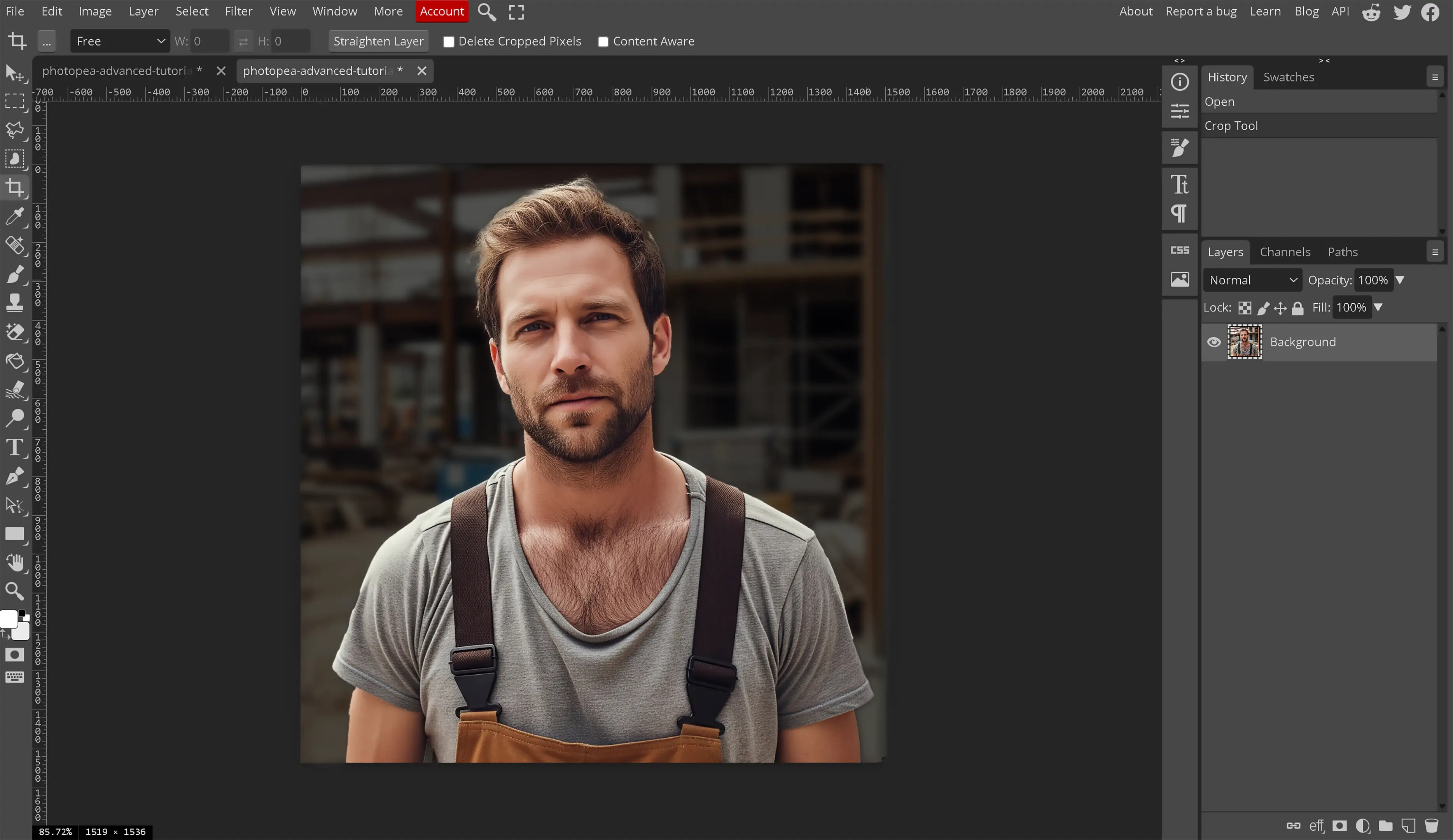
Dodge and Burn
Learning to properly use the Dodge and Burn tool is a necessity for adding that much needed contrast without affecting hue or saturation.
The Dodge tool is used for lightening parts of an image. Overusing the dodge tool will wash out these areas and can damage the look of your image whereas using it properly can enhance the image and make it pop on the screen.
The burn tool darkens areas within the image. It creates darker shadows and allows for the contrast on the opposite side of the tonal range than the dodge tool. Using the burn tool properly such as enhancing those rocks by the water or the water by the beach will help provide that wow factor to your images. Learning to use the burn tool properly is one of those photo editing tricks the professionals don't want you to know about. This is a necessary tool for any photo editor.
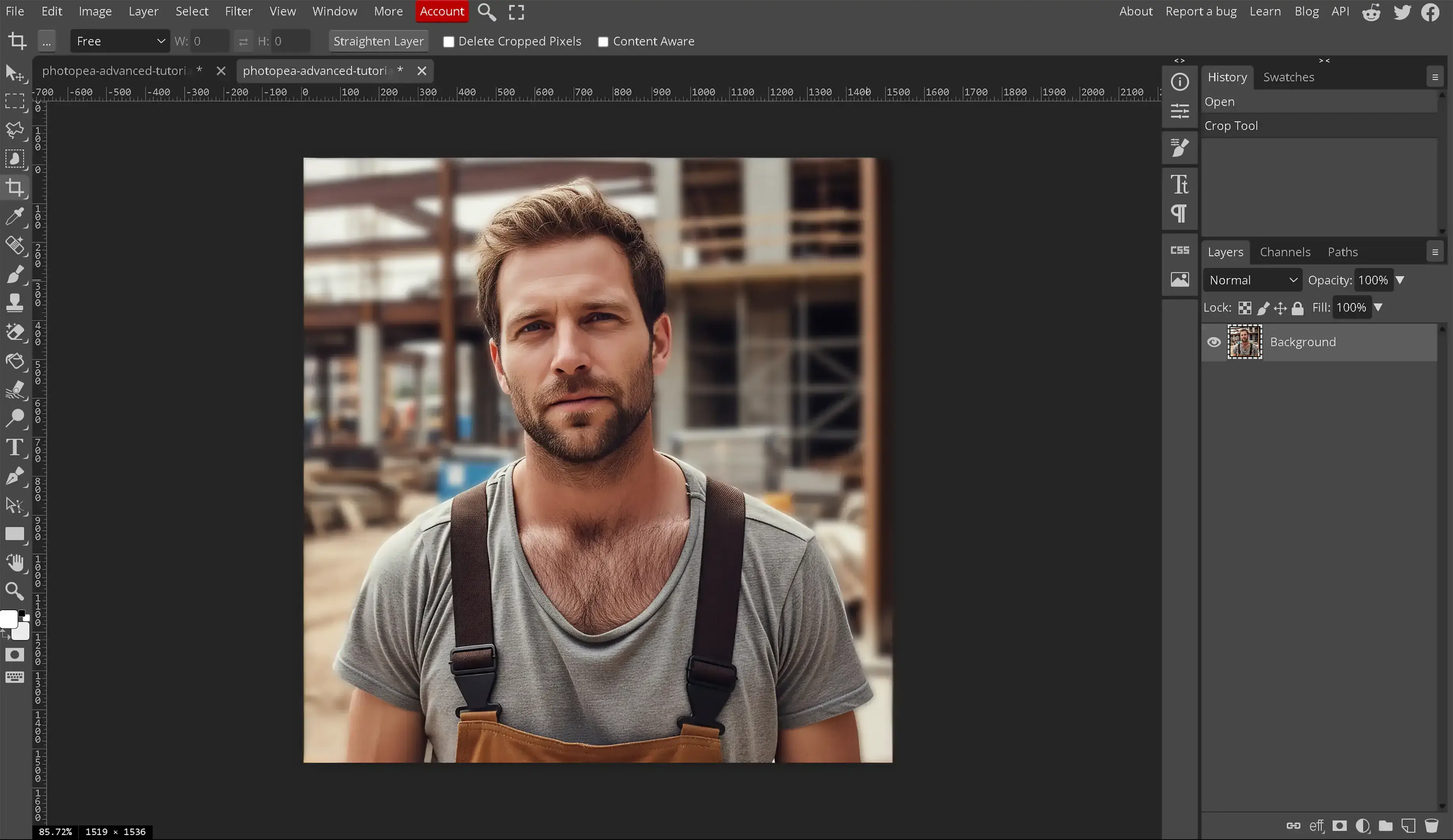
For example, if we want to provide our construction worker with a bit of a sunburn, we would use a very light burn or saturate.

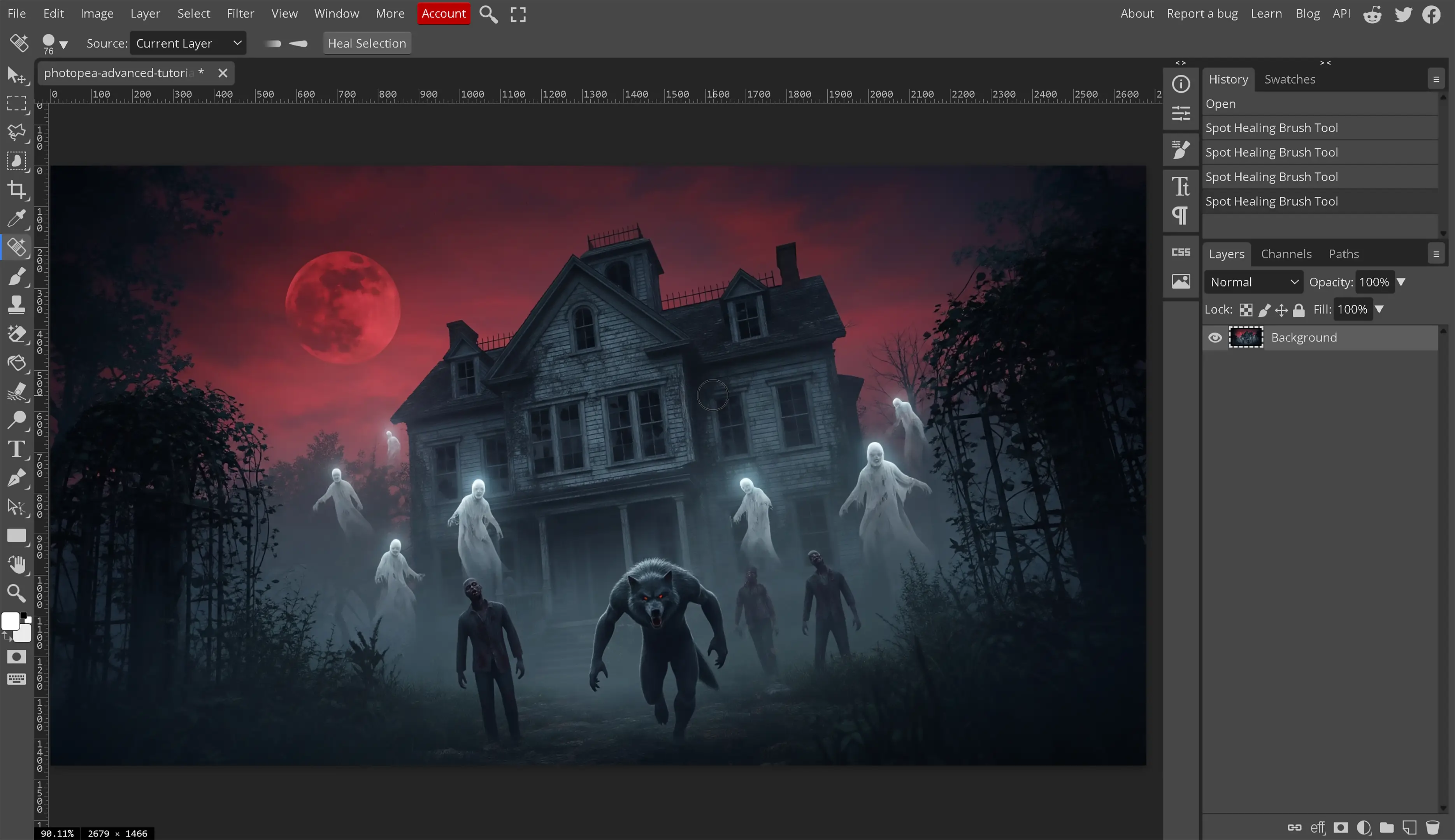
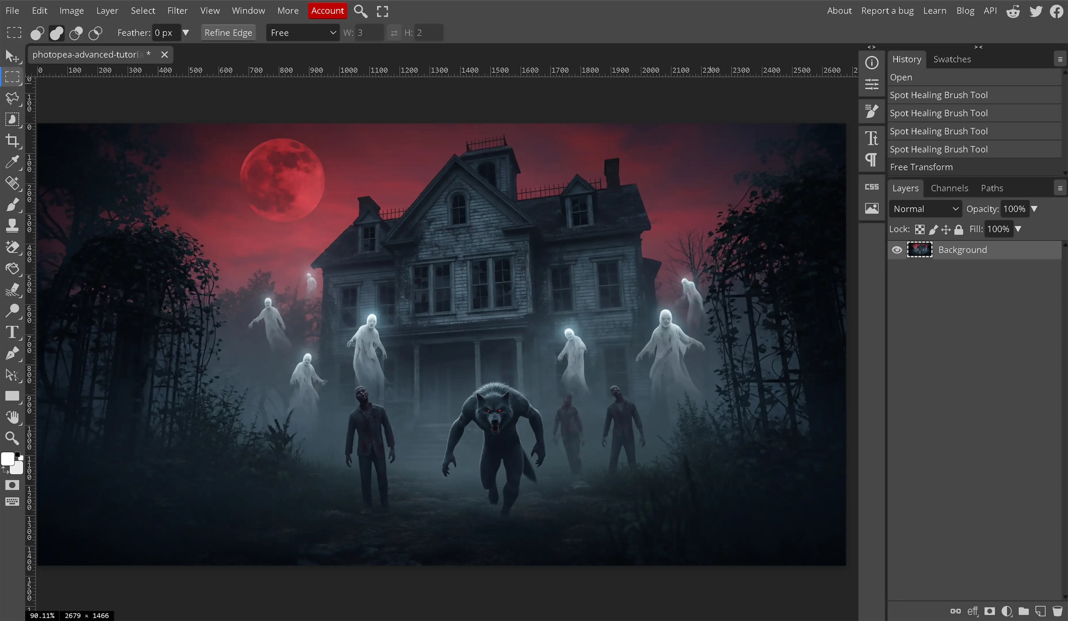
Remove Unnecessary Objects
We have gone over how to remove objects within an image in Photopea. Now it is time to remove unwanted or unnecessary objects from the image. By removing unwanted objects, we can make the image less busy and focus our viewers attention to where we want it rather than letting them decide for themselves. Image editing is all about focus and design and by removing unnecessary objects from the image, we have less distraction in that image. This makes the focus of the image pop even more. If there is no reason for something to be in the image or if the object in question does not enhance or help the image, remove it.
Take for example, the following images. The intent is to have the viewer focus upon the parking lot and cars and not the shopping carts.


Learn HSL
Hue, Saturation, and Luminance. Understanding these terms and how they affect a digital image is extremely important to a digital editor. Do not expect to create flawless composites and not understand these items. These 3 terms are the building blocks for every color we know of as of writing this tutorial.
-
What is Hue?
The easy answer is hue equals the shade of a specific color. We have different colors in everything we look at throughout the world but are they the same color? Is every red in the world the same color red or are there different types of red colors? On the same measuring scale, how about blue? Is every blue in the world the same blue? No, of course not. We know there are what appears to be endless shades of the same color. While there is a very large limit to colors, those different shades of the same color are called the hue of the color.
The technical answer pulled from the following page about Hue on Wikipedia “In color theory, hue is one of the main properties (called color appearance parameters) of a color, defined technically in the CIECAM02 model as 'the degree to which a stimulus can be described as similar to or different from stimuli that are described as red, orange, yellow, green, blue, violet,' within certain theories of color vision.”
-
What is Saturation?
The easiest explanation to understand, the term saturation refers to the percentage of gray within a color. At 100% saturation, there is 0% gray within the color and the color appears to be vivid and bright. At 0% saturation, there is a 100% gray color and we will appear to have a mid-gray or medium gray color. Some websites state that it will always be black but we haven't been able to repeat that. Learning how to use saturation properly is one more of these image tricks that will help bring images to life.
The technical answer for this, as described in Colorfulness on Wikipedia is “Saturation is the 'colorfulness of an area judged in proportion to its brightness', which in effect is the perceived freedom from whitishness of the light coming from the area. An object with a given spectral reflectance exhibits approximately constant saturation for all levels of illumination, unless the brightness is very high.”
-
What is Luminance?
In short, luminance is a term used to define the measurement of light within a color.
The definition of luminance as defined by the Oxford Dictionary is “the intensity of light emitted from a surface per unit area in a given direction”. While that is a 4.0 definition, what does that mean? Let's discuss the real world application and the digital application for this term to understand its meaning better. In the real world, luminance means the amount of light that is emitted from, passed through, or reflected off an object. This definition was taken from a 2019 article from Gamma Scientific on Luminance.
In the digital world, we must give off a perception of the amount of light within a color so luminance changes the value of how much white or light is given to a specific color or image.
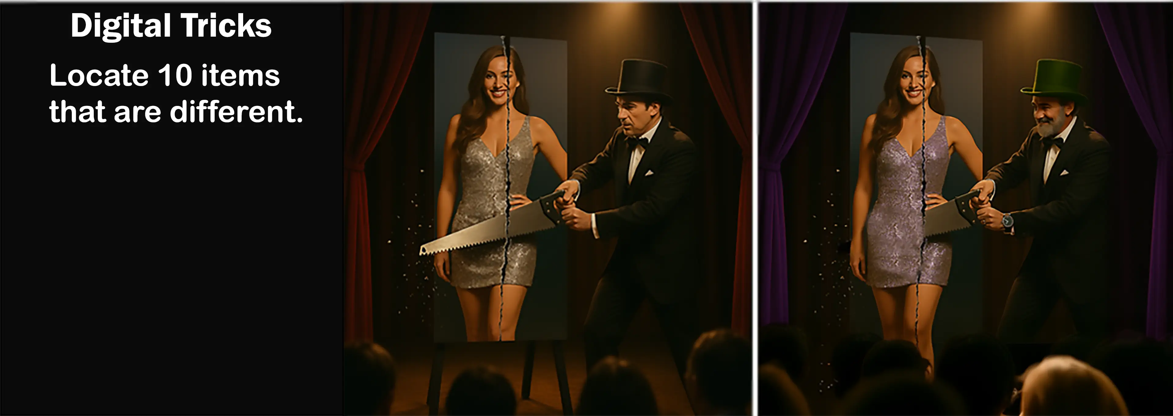
Facebook and Twitter Sharing Image
Did you locate the 10 differences? Leave a comment if you did.