Color Palettes and Color Theory
Color palettes come from Color Theory. The term Color Theory describes the relationship between primary, secondary and tertiary colors, color value, color temperature, color properties, and color harmonies. Do not believe for a minute that someone can learn color theory from one tutorial and while we will cover some of the items about Color Theory, this tutorial is dedicated to the color palette otherwise known as a color scheme or less known as a color pa.
What is a Color Palette, Color PA or Color Scheme?
This is where we are supposed to tell you a color palette is five harmonious colors that work well together but that is not always accurate. There are some disastrous color palettes out there but as long as the color palette follows simple rules, the colors contained within them will work together nicely.
In color theory, a color scheme is the colors utilized in design contexts which is essentially a color palette and color pa is short for color palette. So for the purposes of this tutorial, a color scheme, color pa and color palette are synonymous despite there being slight differences in the definition.
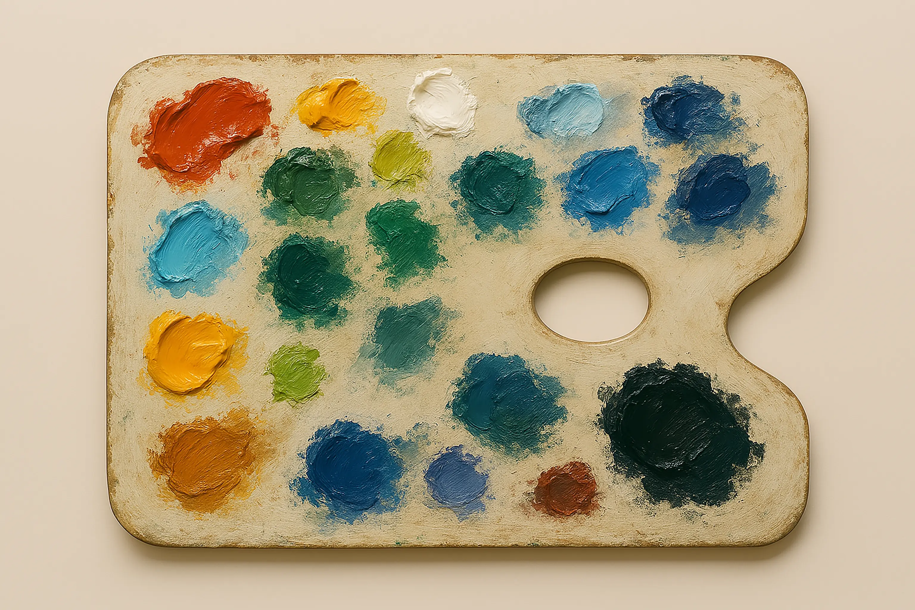
Simply put, a color palette, color scheme, or even a color pa provides the exact colors to be used within a design.
Color Palettes of History
Color palettes have been around way before we were born and go back as far back as 40,000 years ago when artists created the first pigments made from burnt charcoal, animal fat, chalk and soil. To learn more about the color palettes of history, an interesting and fun project is to visit the Color Leap website here: https://colorleap.app/home. This website shows all the different eras throughout history and provides the color palettes used within those eras.
Benefits of Using Color Palettes
The main benefit of using a color palette is to have colors that evenly match the project for which is being planned or actively worked on by artists or designers. We want that perfect collaboration of colors which complement each other and that is the main purpose of using a color palette. Choosing a color palette may prove a little more difficult than using one.
What are The Six Main Color Palettes?
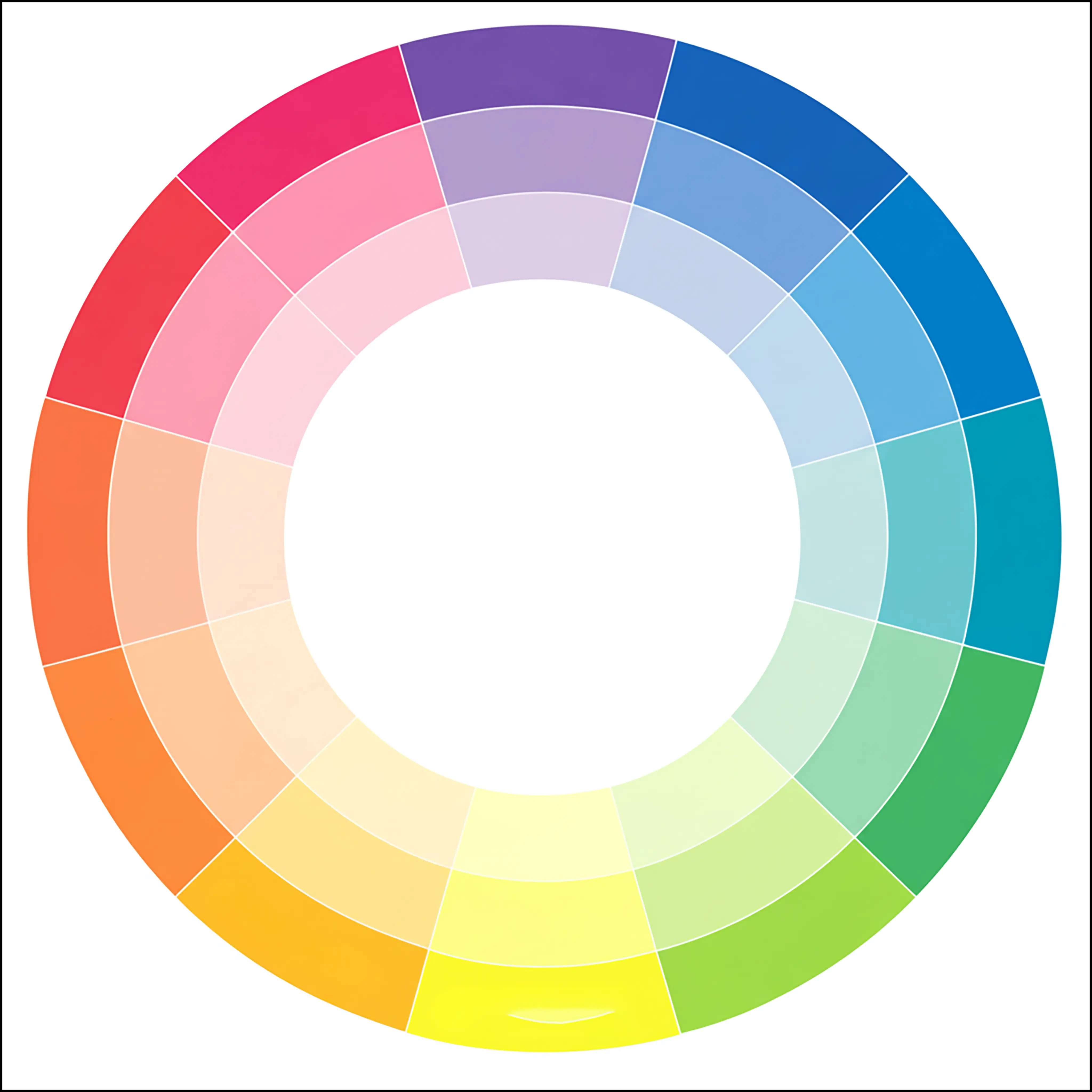
While there are more options when we learn about the Adobe Color Wheel, the main six color palettes, in alphabetical order, are:
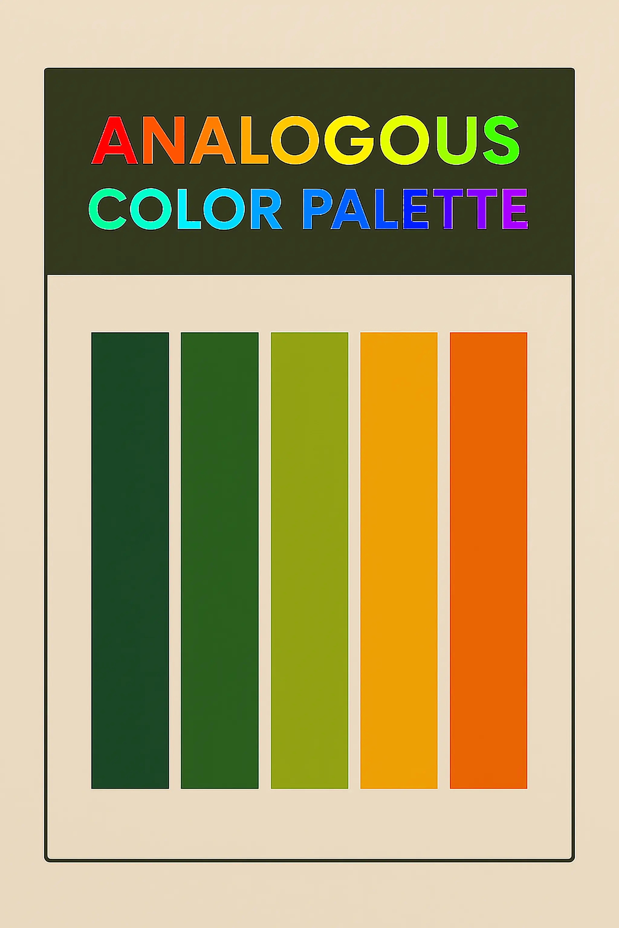
Analogous
Complementary
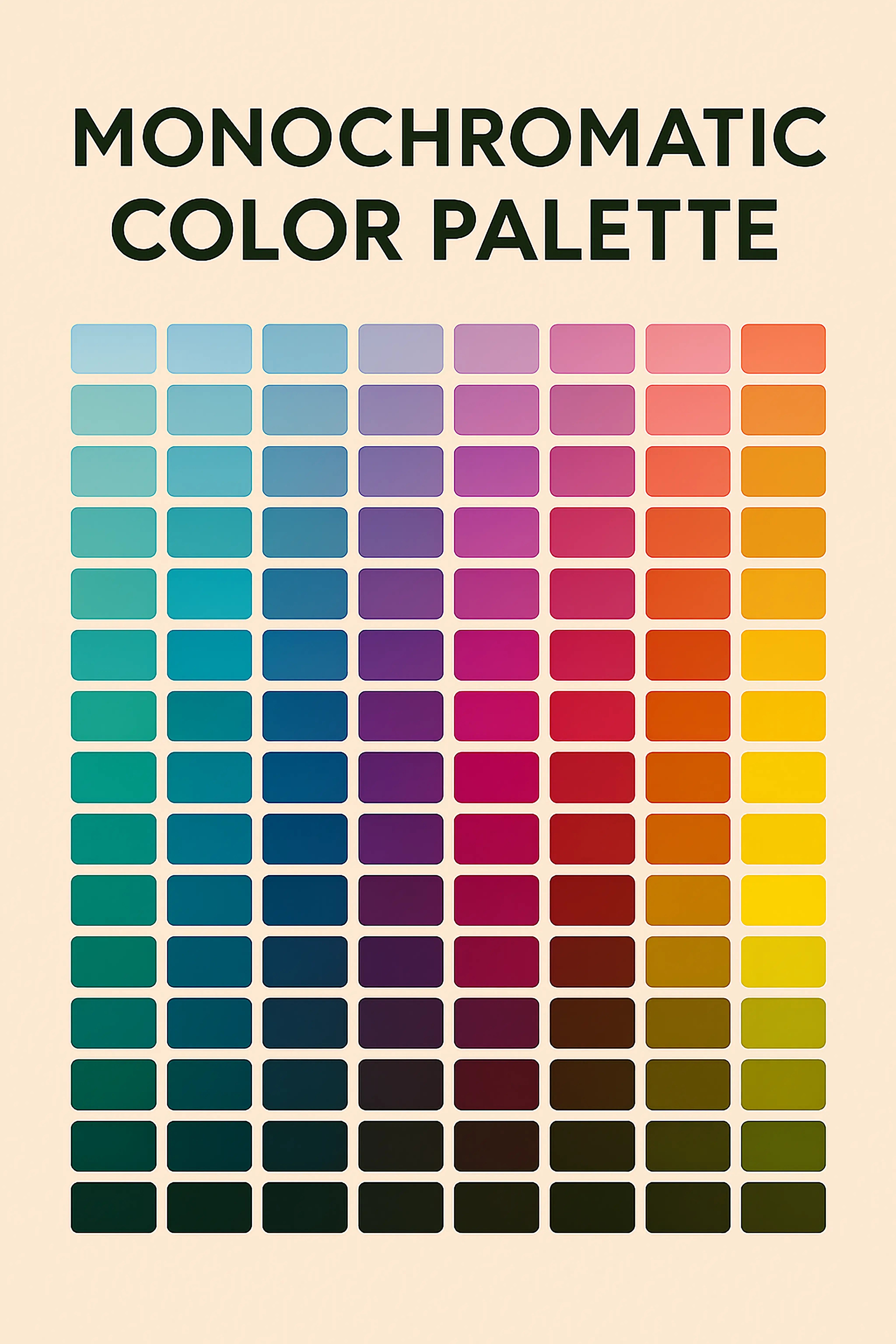
Monochromatic
Split-complementary
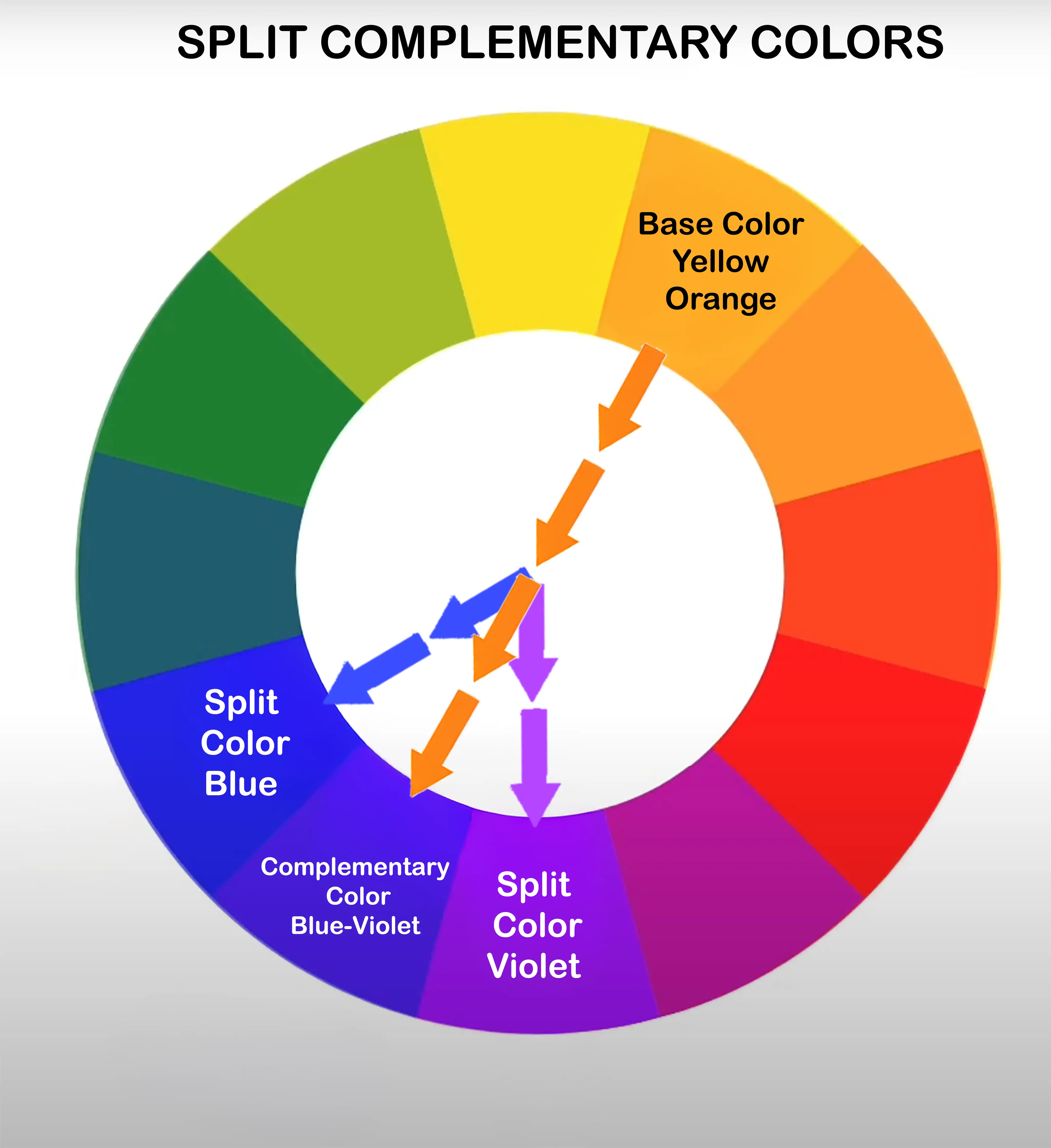
There is a beginners guide to Split Complementary Colors on Inside Decor's website.
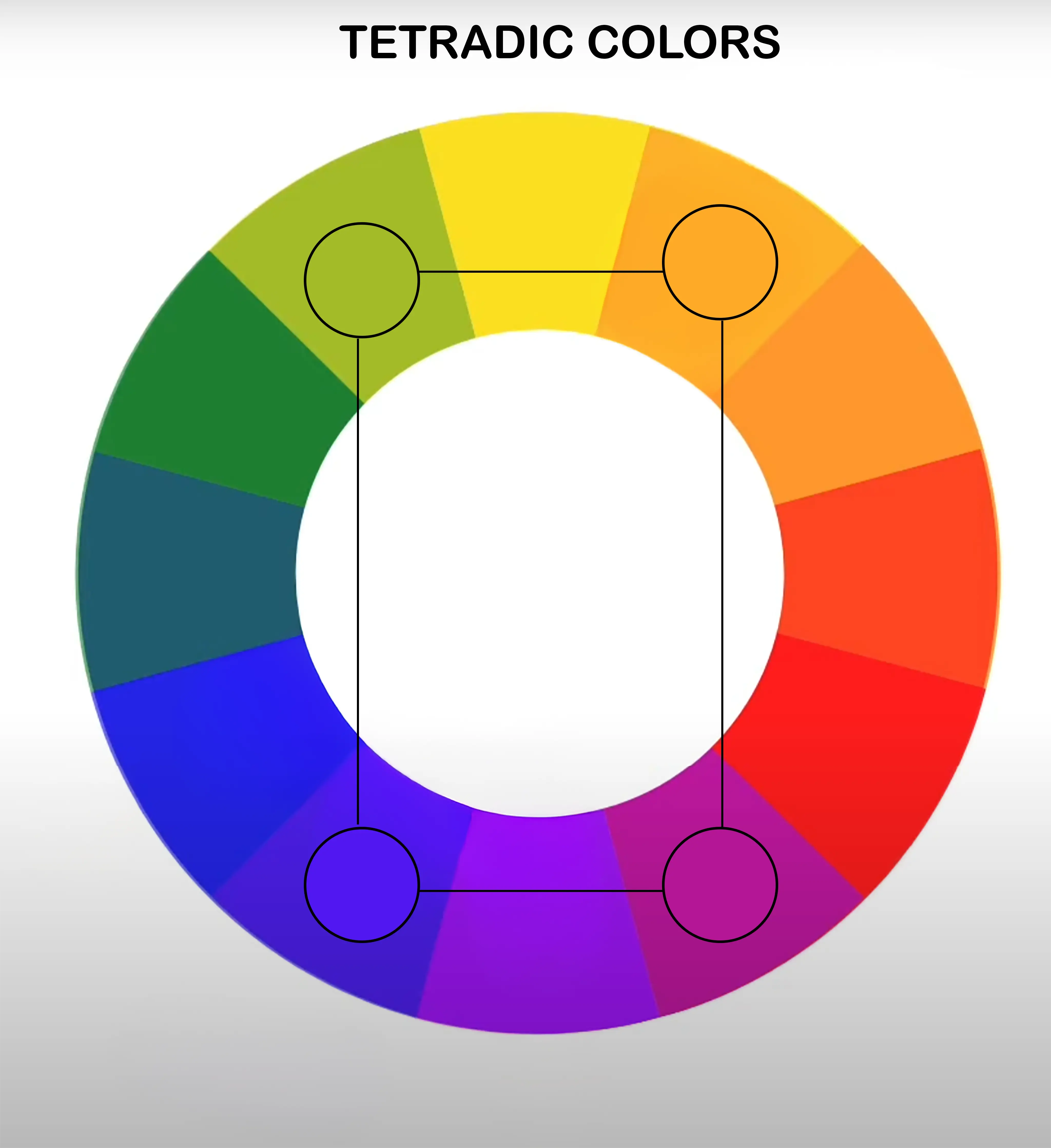
Tetradic
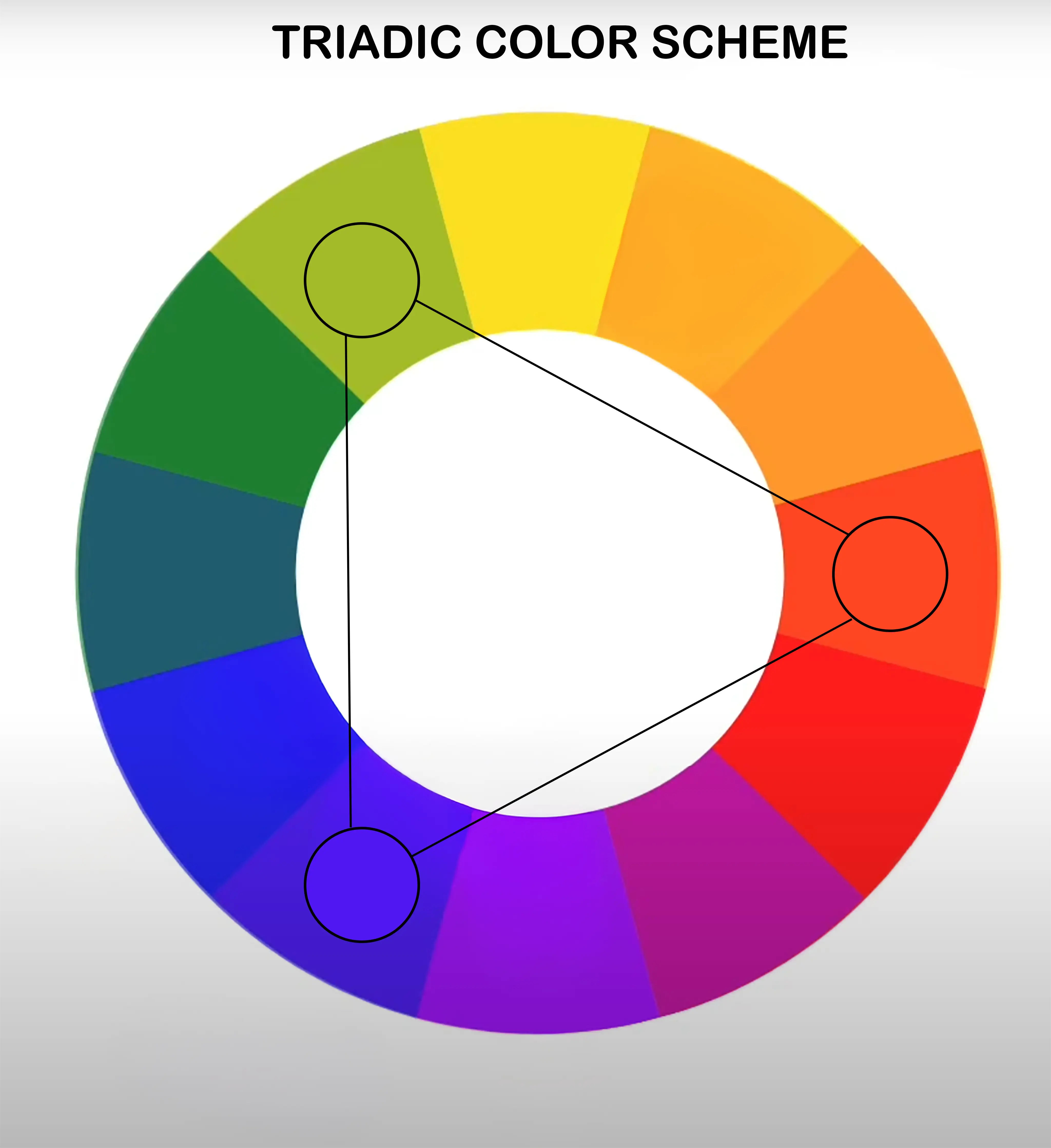
Triadic
Color Associations or Emotional Response
Emotional response to colors has been branded into our brains from the day we were born. We tend to associate colors with a specific response. Red equals hot, blue equals cold and so forth. While everyone is different, knowing what most people associate with each color will help in choosing a color palette for a project.
Let's take a look at some of the meanings or associations that are used with different colors. These are colors that evoke an emotional response from people.
- Black can equal power, elegance or alone and unknown. Black can very easily overtake a photo as the most dominant color so use sparingly such as for text unless it is a black and white image.
- Blue color can mean cold and icy or great authority and trust. Most of the time we associate this with serenity and calm feelings which makes it an excellent choice for our designs.
- Green may evoke thoughts of money if the person lives in the United States or growth, health and well-being.
- Orange is associated with affordable or less expensive, but also with energetic and playful.
- Pink can provide that romantic feeling, appreciation or the feeling of being young.
- Red can be passionate, determined, very important or it can be associated with anger, being upset or even danger.
- Yellow can remind us of the warm sunshine, positivity or being warned or scared.
- White may equal virtue or innocence.
- Gray can make us think about being gloomy or neutral.
60-30-10 Rule
The sixty-thirty-ten (60-30-10) rule is a simple rule that was created to help real world designers know how much color is too much and what is appealing with the color choices. We can use this rule in the digital world as well. Once we have chosen a color palette, our next step is to know how much color to use and that is where the 60/30/10 rule comes in extremely handy.
The 60-30-10 rule states to use the main, or predominant, color in 60% of our design while only using 30% for our secondary color and finally 10% for any of our accent colors.
A real world example of this could be designing a room. Sixty percent would be the walls, rugs, a couch or loveseat. Next, thirty percent would be made up from the chairs, other furniture or perhaps a feature or an accent wall.
The final ten percent could be pillows, accessories or perhaps center pieces of paintings on the wall.
If we keep the 60-30-10 rule in mind while editing photos, this helps simplify what colors we will use within our photos or designs when we are choosing colors to go onto our color palette.
How to Choose a Color Palette
The answer to this is not a very easy answer and is quite complicated on how to choose the perfect color palette. To really understand a color palette, we must know color theory very well and be very comfortable with design. That is not to say we cannot learn but be prepared for quite a long answer.
There is an excellent blog entry written by CareerFoundry for the Introduction to Color Theory and Color Palettes. They go into great detail about Color Theory and Color Palettes as well as how to choose a color palette.
We encourage our readers to read their full article but a short synopsis of their blog entry directly related to how to choose a color palette is:
- Know the target audience.
- Consider emotional responses.
- Do not forget about color psychology.
- Choose colors wisely.
- Use color contrast.
- Light backgrounds are your friend.
- Dark text is easy to read.
- Obtain feedback from user testing.
Color Palette Generators
Color palette generators are an excellent method to create a color palette, or color scheme, that fits our project. Using color theory and algorithms, color palette generators will, as the name suggests, automatically generate a color palette based on initial figures that are either entered or colors that are chosen from a color wheel. We will learn more about color wheels in the next lesson. Here are some online color palette generators to help get started.
- Color Hunt:
https://www.colorhunt.co - Coolors:
https://coolors.co - Adobe Color Wheel:
https://color.adobe.com/create/color-wheel